
JsonForms is a powerful and very flexible framework to build complex forms just from a JSON Schemata. A form can contain various different controls and controls can be separated into categories and layout sections. This makes JsonForrms a first-hand framework if you have to deal with dynamic forms in a JavaScript application.
JsonForms already provides different so called Renderer Sets to handle complex input widgets. But further more you can also create easily you own widget if you have special needs not supported by JsonForms out of the box.
The SelectItem Control
In one of my applications I run into such a situation where I needed a special handling for Radiobuttons and Checkboxes.
My back-end data model provided a SelectItem schema in lists of label|value pairs, like:
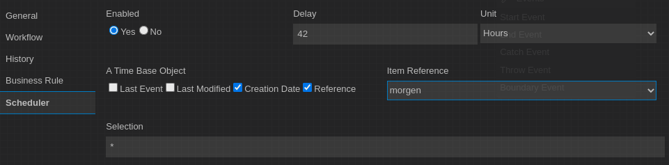
Last Event | 1
Last Modified | 2
Crated | 3
Refernce | 4
So the user should see readable Labels but the assigned value is a number between 1-4. This kind of data handling and UISchema is not supported by JsonForms out of the box. To solve this I developed a custom SelectItem-Control for the Vanilla-Renderer that can handle this kind of Schemas.
An example for the corresponding JsonForms Data and Schemata looks like this:
Data
===========================================
{
"enabled":"1",
"baseobject":["4","3"]
}


Schema
===========================================
{"type":"object","properties":{
   "enabled":{"type":"string","enum":[
      "Yes|1",
      "No|0"
   ]},
   "baseobject":{"type":"string","enum":[
       "Last Event|1",
       "Last Modified|2",
       "Creation Date|3",
       "Reference|4"
   ]},
  }
}

UI Schema
===========================================
{"elements":[{"type":"HorizontalLayout",
  "elements":[
   {"type":"Control","scope":"#/properties/enabled",
    "label":"Enabled",
    "options":{"format":"selectitem"}
   },
   {"type":"Control","scope":"#/properties/baseobject",
    "label":"A Time Base Object",
    "options":{"format":"selectitem"}
   }]
}
You can see, that the Schema provides the label / value combination separated with a ‘|’ char. The data structure provides the value part only. And in the UISchema the option ‘format’ refers to the option ‘selectitem’ which is handled by my custom JsonForms control.
The main task of this custom control is to split the Label|Value schema into two parts and update the data element only with the value part. The full implementation of this custom control looks like this:
import {
  and, computeLabel, ControlProps, isDescriptionHidden, isEnumControl, optionIs, OwnPropsOfEnum, RankedTester, rankWith
} from '@jsonforms/core';
import { withJsonFormsEnumProps } from '@jsonforms/react';
import { VanillaRendererProps, withVanillaControlProps } from '@jsonforms/vanilla-renderers';
import merge from 'lodash/merge';
import React, { useState } from 'react';

export const SelectItemGroup = ({
  classNames,
  id,
  label,
  options,
  required,
  description,
  errors,
  data,
  uischema,
  visible,
  config,
  enabled,
  path,
  handleChange
}: ControlProps & VanillaRendererProps & OwnPropsOfEnum) => {
  const [isFocused, setFocus] = useState(false);
  // const isValid = errors.length === 0;
  const appliedUiSchemaOptions = merge({}, config, uischema.options);
  const showDescription = !isDescriptionHidden(
    visible,
    description,
    isFocused,
    appliedUiSchemaOptions.showUnfocusedDescription
  );

  let groupStyle: { [x: string]: any } = {};
  // compute flexDirection based on the optional option 'orientation=vertical|horizontal'
  groupStyle = {
    display: 'flex',
    flexDirection: ('vertical' === uischema!.options!.orientation) ? 'column' : 'row'
  };

  const handleSelectionChange = (target: any, value: any) => {
      let newData;
      console.log('===> handleSelection');
      // test if we have an array
      if (Array.isArray(data)) {
        // add value only if not yed done
        if (!data.includes(value)) {
          // data.push(value);
          newData = [...data, value];
        } else {
          newData = data.slice();
          const iPos: number = data.indexOf(value);
          if (iPos !== -1) {
            // data.splice(iPos, 1);
            newData.splice(iPos, 1);
          }
        }
      } else {
        // data = value;
        newData=value;
      }
      // finally we call the default change event handler...
      handleChange(path, newData);
  };

  /**
   * Returns true if if the current value is selected
   *
   * @param value
   */
  const isSelected = (value: string): boolean => {
    // test if we have an array
    const _valuePart=getValuePart(value);
    if (Array.isArray(data)) {
      return data.includes(_valuePart);
    } else {
      return data === _valuePart;
    }
  };

  /**
   * Returns the value part of a label|value pair
   * @param value
   * @returns
   */
  const getValuePart = (value: string): string => {
    const parts = value.split('|');
    if (parts.length===2) {
      return parts[1];
    }
    else {
      return value;
    }
  };

  /**
   * Returns the label part of a label|value pair
   * @param value
   * @returns
   */
  const getLabelPart = (value: string): string => {
    const parts = value.split('|');
    if (parts.length===2) {
      return parts[0];
    }
    else {
      return value;
    }
  };

  return (
    <div
      className={'control imixs-checkbox-group'}
      hidden={!visible}
      onFocus={() => setFocus(true)}
      onBlur={() => setFocus(false)}
    >
      <label htmlFor={id} className={'imixs'}>
        {computeLabel(
          label,
          false,
          appliedUiSchemaOptions.hideRequiredAsterisk
        )}
      </label>
      <div style={groupStyle}>
        {options!.map(option => (
          <div key={option.label}>
            <input
              type={(Array.isArray(data)) ? 'checkbox' : 'radio'}
              value={getValuePart(option.value)}
              id={path + getValuePart(option.value)}
              name={id}
              checked={isSelected(option.value)}
              onChange={ev => handleSelectionChange(ev.currentTarget, ev.currentTarget.value)}
              disabled={!enabled}
            />
            <label>
              {getLabelPart(option.label)}
            </label>
          </div>
        ))}
      </div>
      <div className={'input-description'}>
        {showDescription ? description : undefined}
      </div>
    </div>
  );
};

export const SelectItemGroupControl = (props: ControlProps & VanillaRendererProps) => {
  return <SelectItemGroup {...props} />;
};

export const selectItemControlTester: RankedTester = rankWith(
  3,
  and(isEnumControl, optionIs('format', 'selectitem'))
);
export default withVanillaControlProps(withJsonFormsEnumProps(SelectItemGroupControl));
To register this custom renderer you can simply register the new component before you setup your form part. My example code is based on React:
                    const myRenderers = [
                       ...vanillaRenderers,
                       // optional register custom renderers...
                       { tester: selectItemControlTester, renderer: SelectItemGroupControl }
                    ];

                    this.myContainer.render(<JsonForms
                            data={myData}
                            schema={mySchema}
                            uischema={myUISchema}
                            cells={vanillaCells}
                            renderers={myRenderers}
                            onChange={({ errors, data }) => this.setState({ data })}
                            key={this.selectedElementId}
                        />);
That’s it. The new control is now applied by JsonForms whenever a UISchema element contains the option ‘selectitem‘. This is a nice addition to handle a special data schema and it shows how flexible the JsonForms concept is.
You can find a full description how to create you own custom control here.